
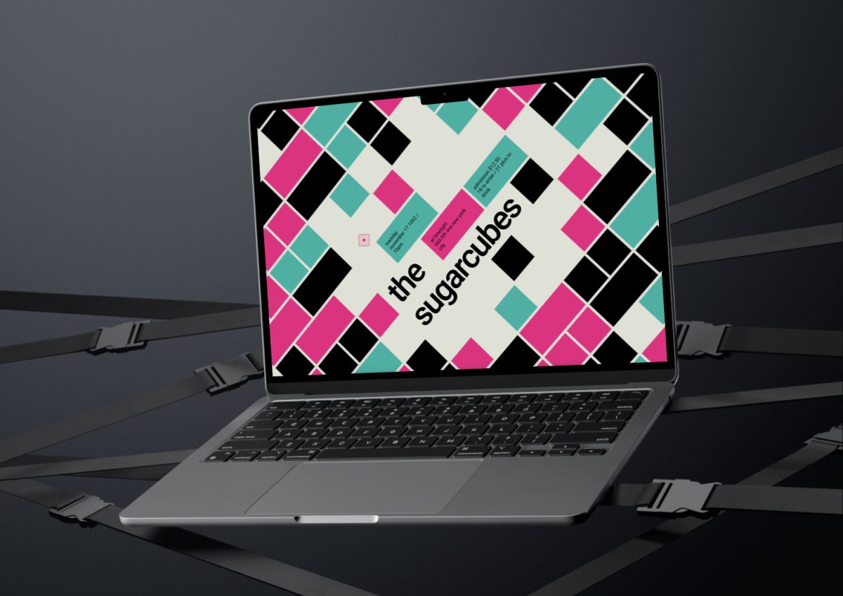
Translating a punk-inspired poster into a digital rhythm — interaction meets attitude.
What?
As part of the course Webtechnologien at the Schule für Gestaltung Zürich, I was challenged to turn a printed typographic poster into an interactive digital experience.
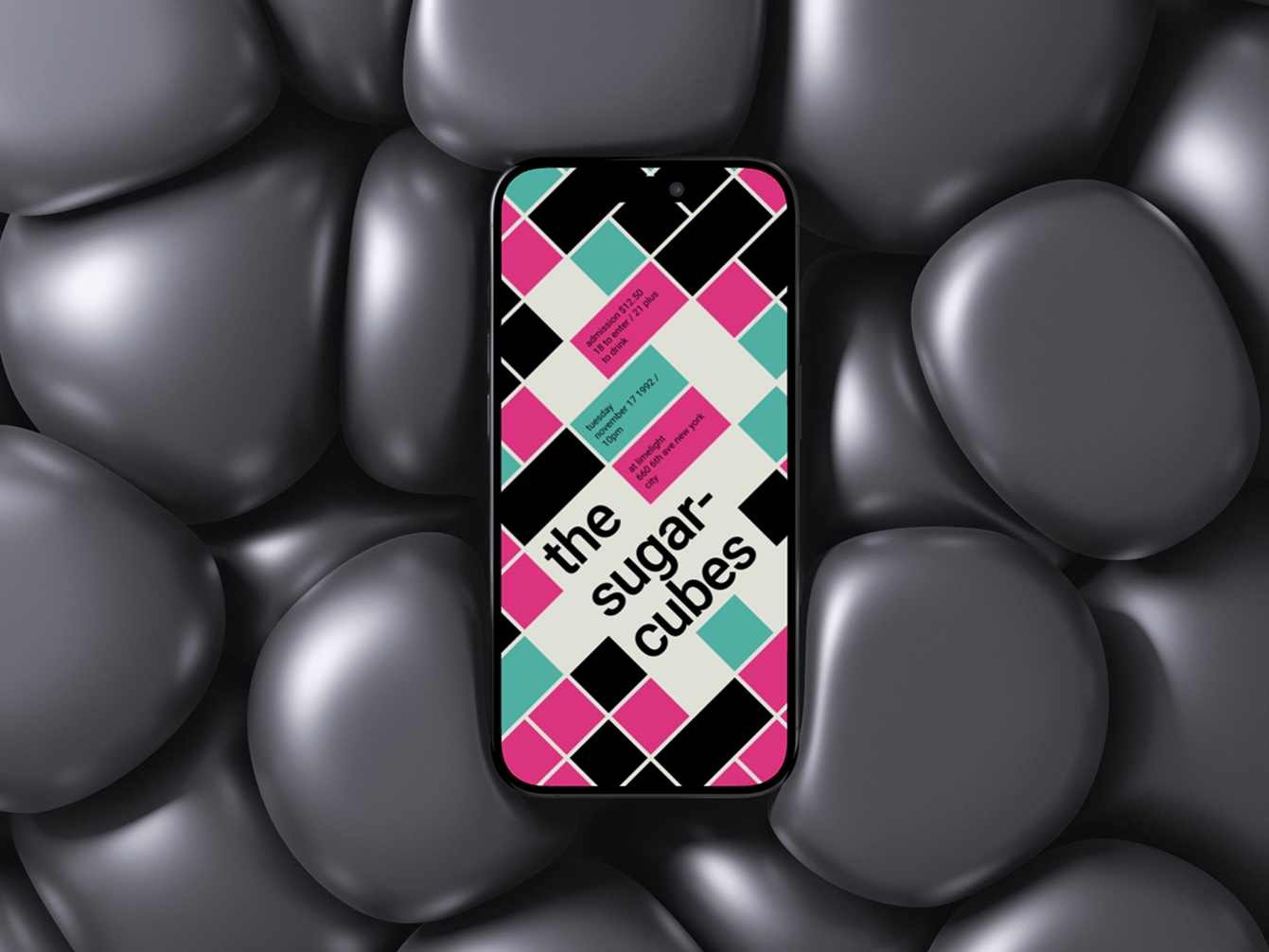
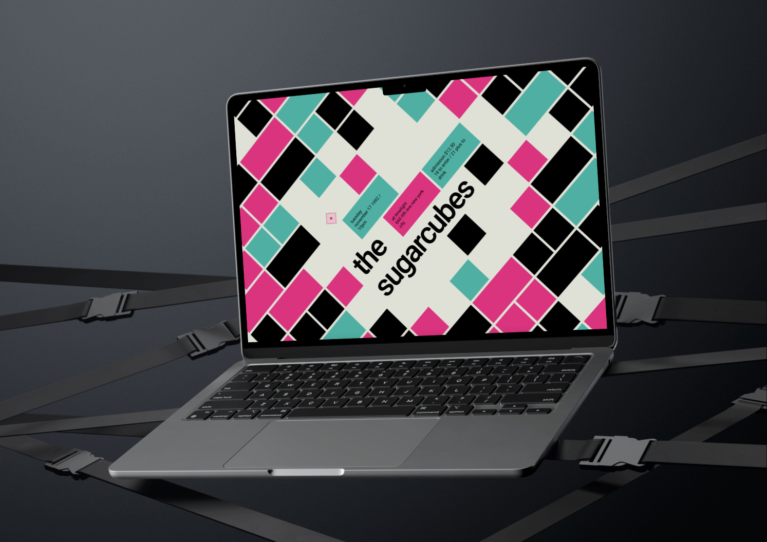
The task: reinterpret an existing Swissted poster for the band The Sugarcubes and bring it to life on the web. The goal was to explore how movement, interaction and responsiveness can transform static design into a living interface — while staying true to the original’s bold, energetic attitude.
~ 5
versions from draft to final release
> 110
commits to my GitHub-Repo
∞
lines of code refactored for rhythm, structure and mood
How?
The project followed an iterative development process with five main stages:
- Draft: A purely static version that captured the basic layout without interactivity or animation.
- v1: A hardcoded approach using raw HTML/CSS, offering full control over layout but limited flexibility.
- v2: A dynamic version that generated all elements via JavaScript — fewer lines of code, more logic-based structure.
- v3: A refined version of v2, introducing a flipping animation for a more engaging user experience.
- Final: The polished result — responsive, animated, and fully interactive, with clear visual rhythm inspired by the original poster.
Throughout the process, I experimented with animation timing, grid layouts, DOM manipulation and how subtle interactions could elevate the visual impact.
Learnings.
This project taught me how to think like a developer and a designer. I learned:
- How to structure code dynamically without losing creative control
- The value of fast iteration with versioning
- How animations can reinforce the tone of visual design
- The importance of browser testing and accessibility in interactive layouts