
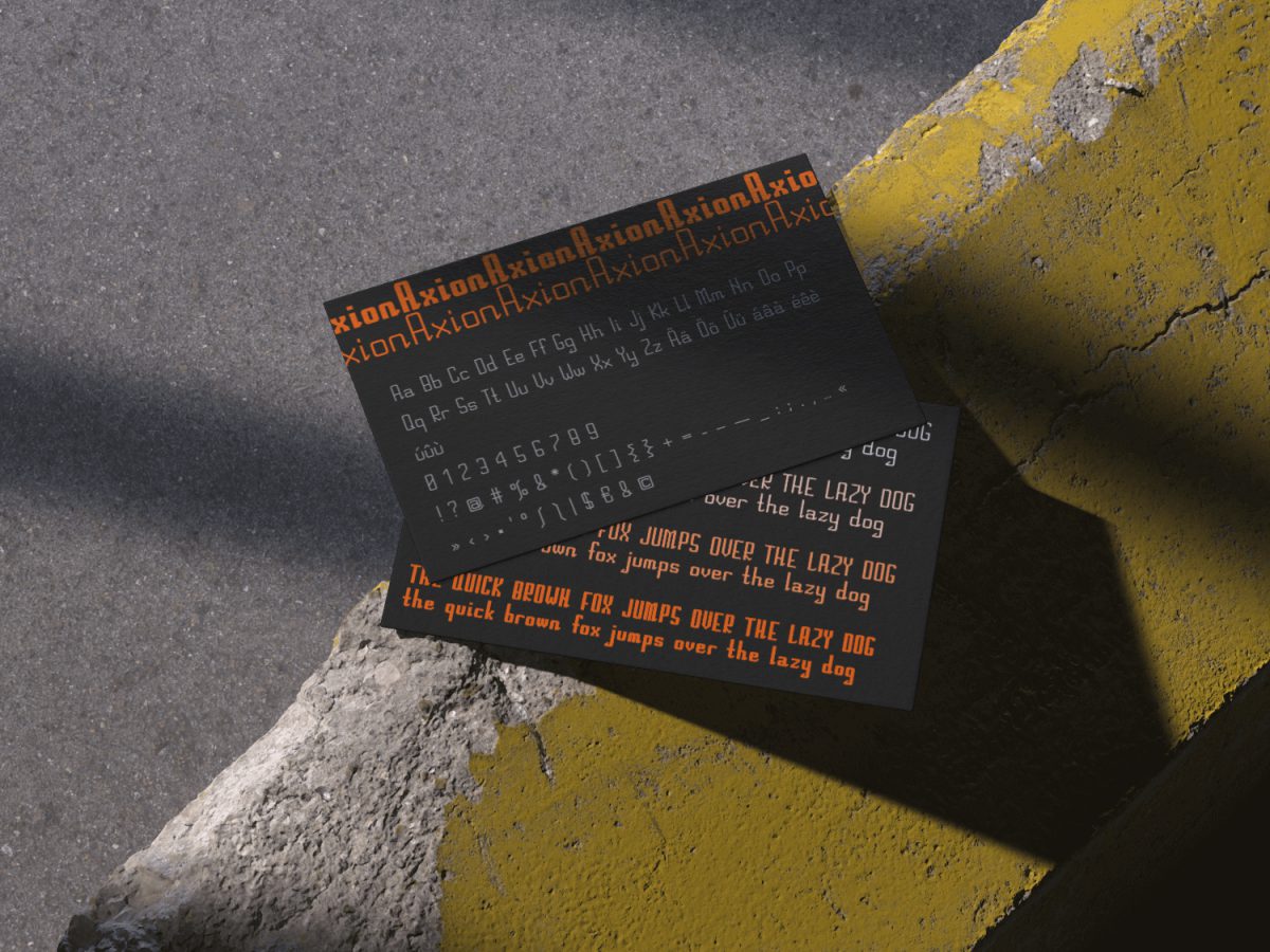
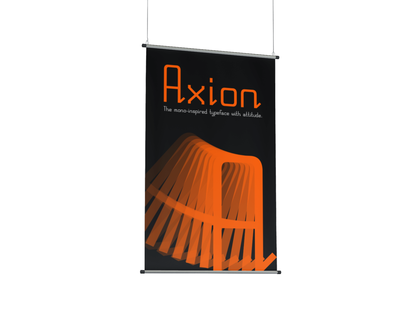
Axion is a self-developed display typeface focused on modular construction and geometric consistency.
What?
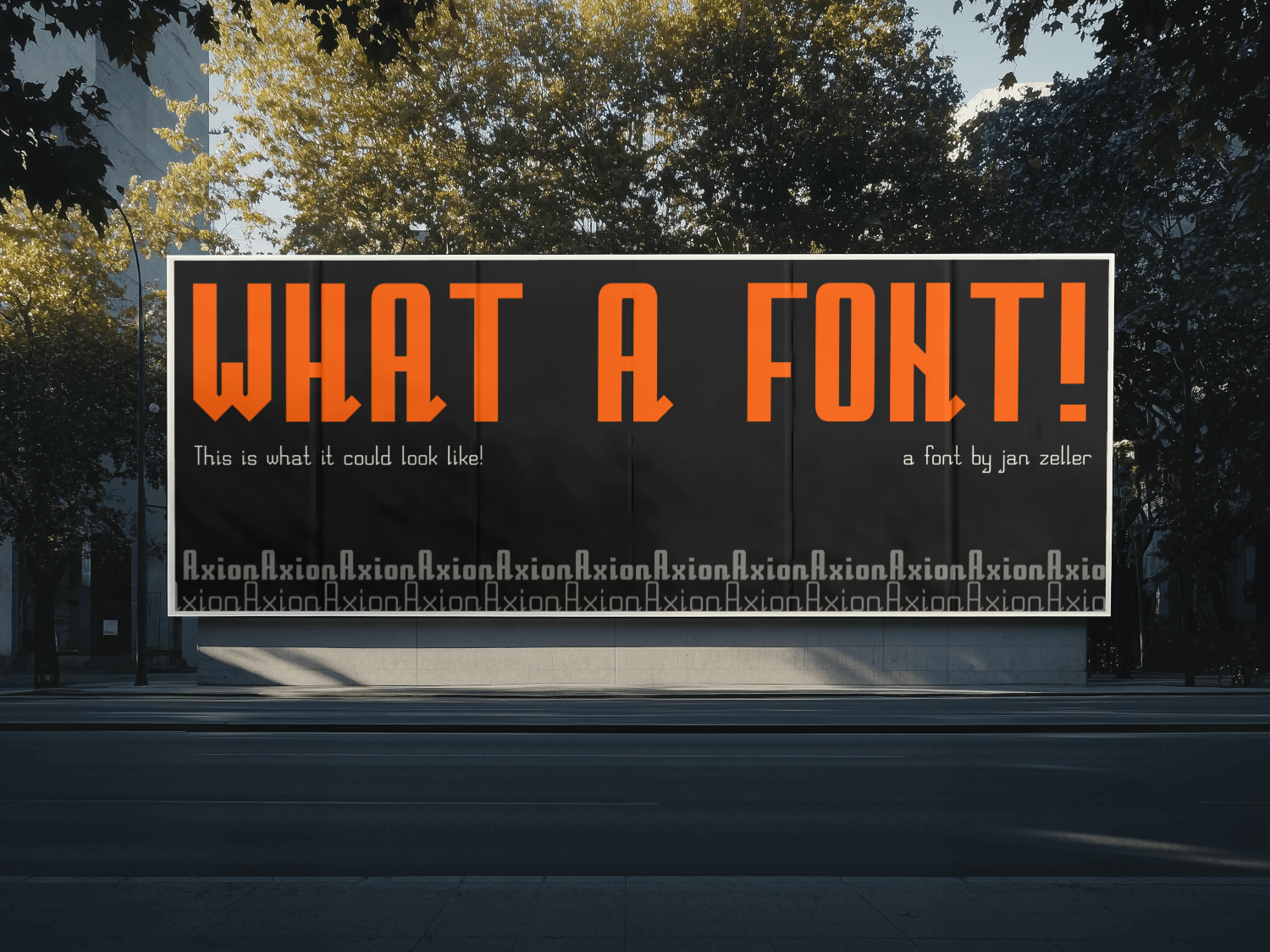
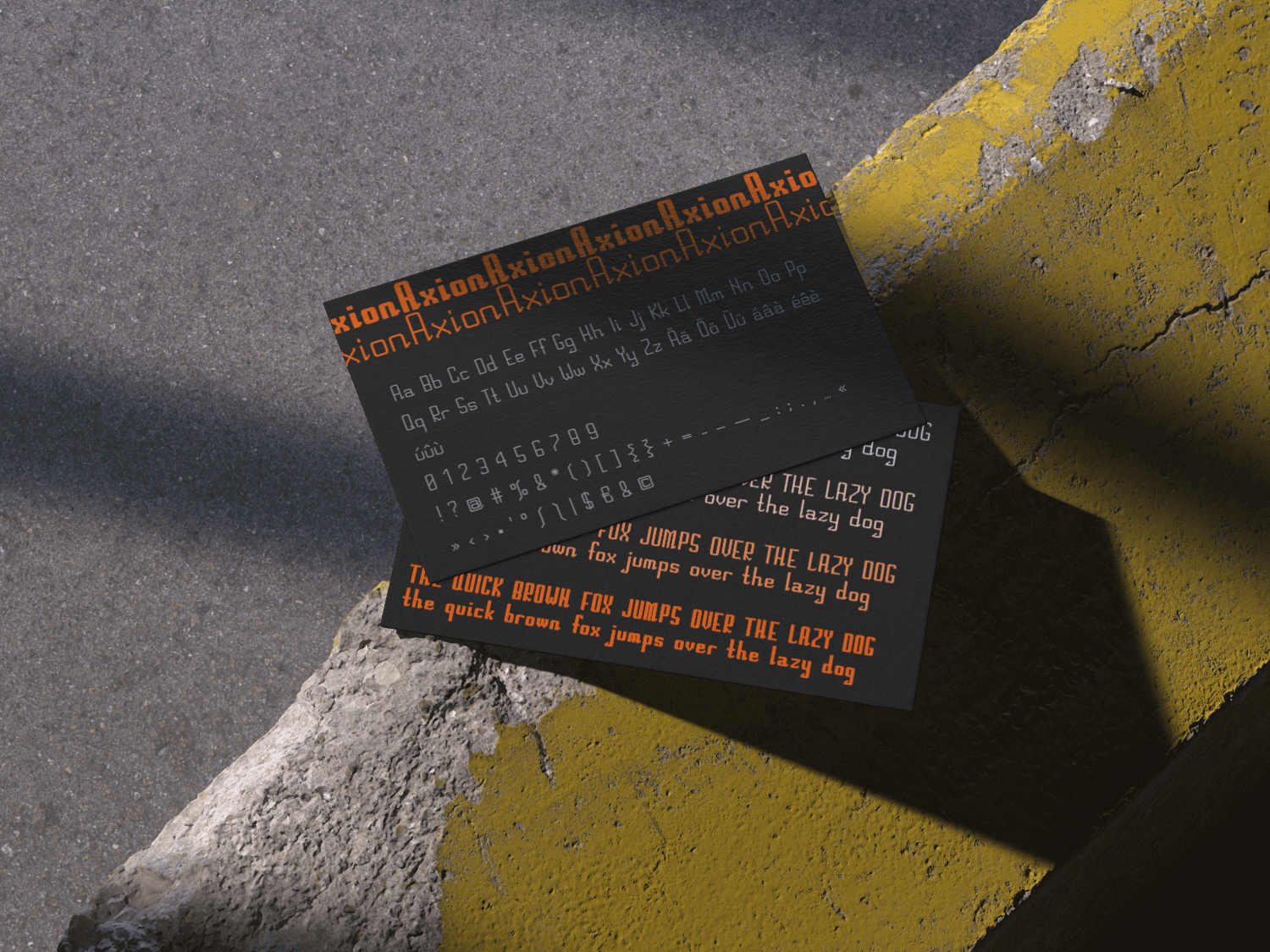
Axion is a strictly constructed geometric typeface based entirely on 45° and 90° angles. Every stroke, curve, and terminal follows a modular logic, creating a sharp, futuristic tone with a subtle sense of tension. The font features a low x-height, high ascenders, and angular stroke endings. Despite its rigid constraints, Axion achieves expressive character and rhythm.
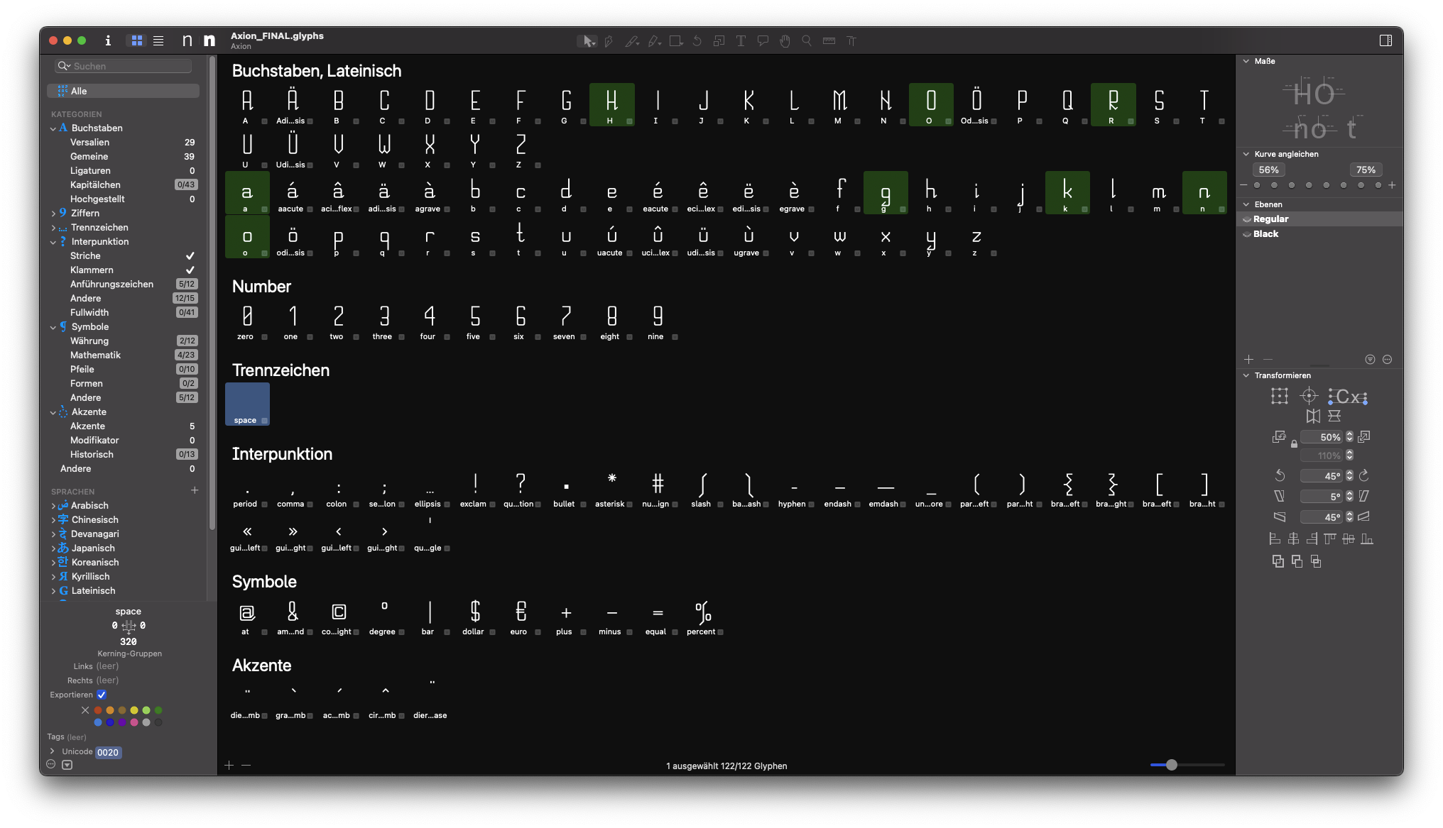
The final version includes four weights – Regular, Medium, Bold, and Black – and contains 117 glyphs, including accents, punctuation, symbols, and currency signs.
117
glyphs designed
4
font-weights
6 days
from 0 to the final font
How?
This typeface was entirely designed and built by me over the course of around six days. At first, I was overwhelmed by the variety of styles and directions a font could take. My initial idea was to create something playful and “bubbly,” but the lack of consistency in such a style quickly became a problem.
Switching directions, I explored monospace and tech-inspired fonts like Space Grotesk. That led me to the concept: what if all letters followed a strict 45° serif and used minimal curvature? Early sketches confirmed this idea was both practical and visually unique.
I built the font around a modular grid, which helped maintain consistency and reuse forms across characters. The Black master brought new challenges: thick weights forced me to adapt several letters like a and e due to space constraints, and readability issues emerged in dense characters like H and N.
Learnings.
This project completely reshaped how I see typography. I learned how hard it is to maintain consistency while also creating visual interest. I also gained insight into the balance between concept and aesthetics – sometimes, strict rules had to be broken to preserve readability.
Working within a constructed system made it easier to stay focused and complete a full character set. Looking back, I would have started with a lighter weight to allow for better automatic interpolation. Still, I’m proud of how Axion turned out and excited to see how it performs in real design contexts.