
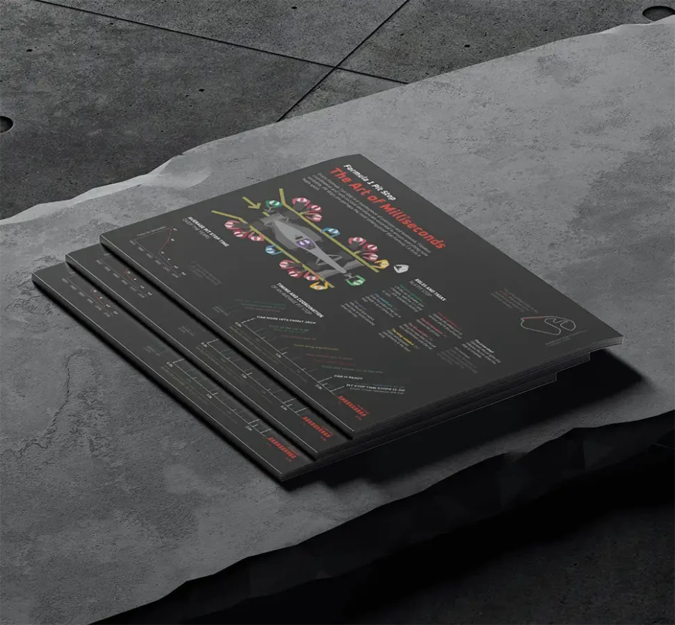
Designing this infographic was like a pit stop itself: fast, focused, and all about coordination.
What?
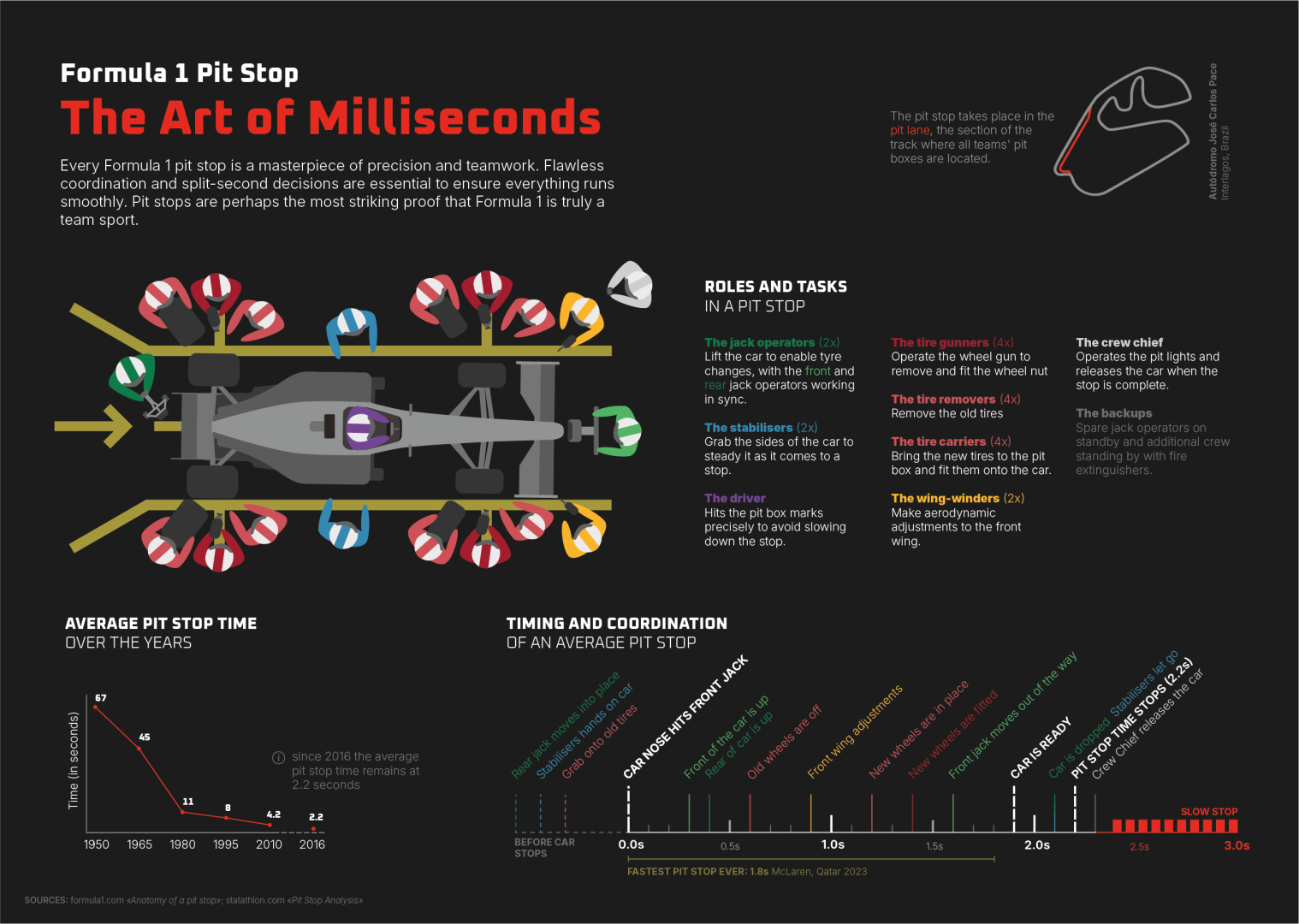
As part of the Infographics module at Schule für Gestaltung Zürich, I created a full-spread A3 infographic for print, focusing on the complexity of a Formula 1 pit stop. The task was to pick a topic of our choice and turn it into a clear, well-structured visual narrative. I chose to break down the choreography behind one of the sport’s most iconic moments — the pit stop — where up to 20 people work in perfect sync to change tires in under three seconds.
The goal of the infographic was to show the different team roles, the timeline of the stop, and the invisible complexity behind what looks like a simple pause in the race.
5+
design iterations to get layout and balance just right
500 MB
size of my illustrator file
2 days
time in which this project was done
How?
The project started with rough sketches to map out the content blocks and visual hierarchy. I explored various visual directions and layout strategies before building the final version in Adobe Illustrator.
Finding consistent and reliable data was a challenge — much of the information available online is scattered or incomplete. I had to curate, condense, and verify what made it into the final composition.
During the design process, I created several versions, constantly refining layout, type hierarchy, and content density. Illustrator wasn’t my strongest tool at the beginning — but versioning helped me build up my confidence and workflow.

Learnings.
This project sharpened my understanding of editorial design principles — especially how much clarity matters in information-heavy graphics. I learned to:
- Prioritize structure over visual gimmicks
- Cut back on “fun facts” in favor of storytelling depth
- Build versions quickly to test layout ideas
- Think in layers and reader journeys: from overview to detail