
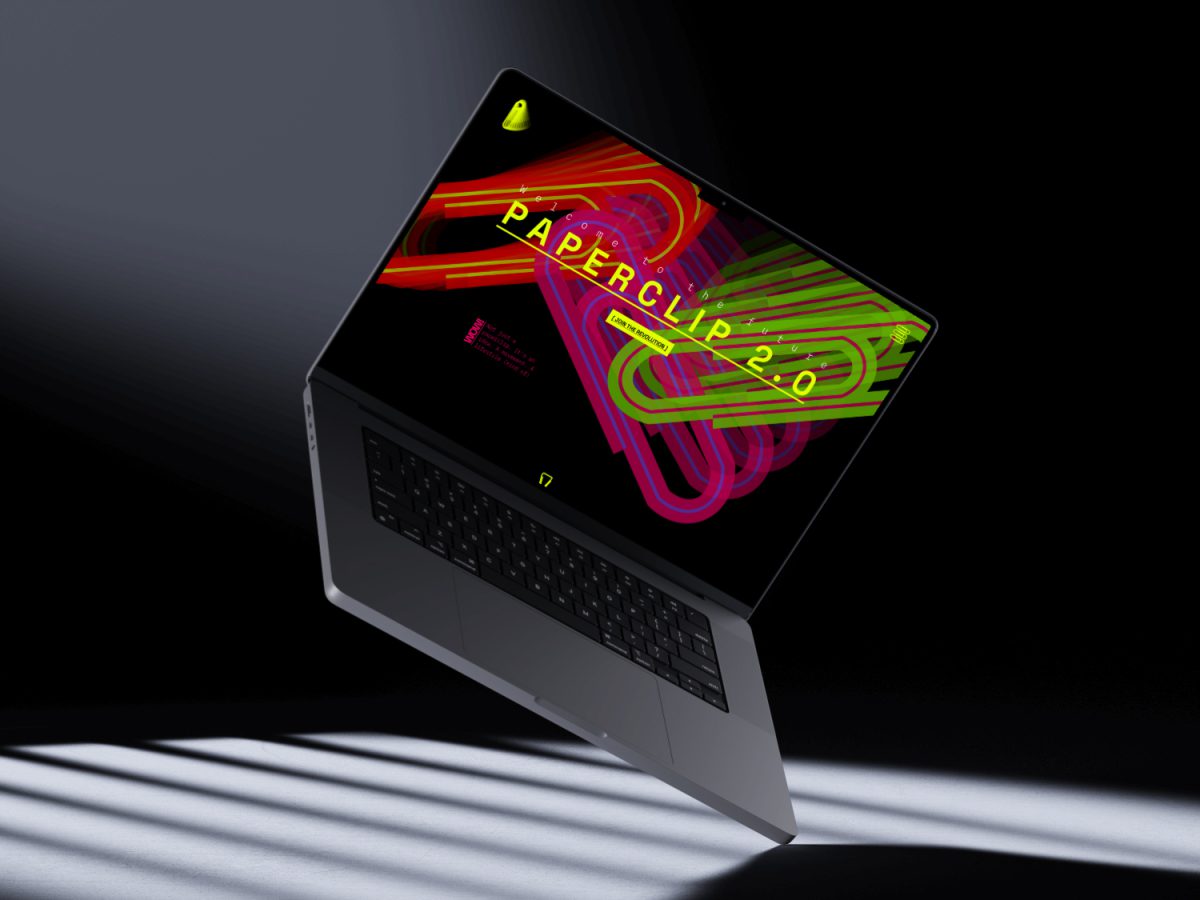
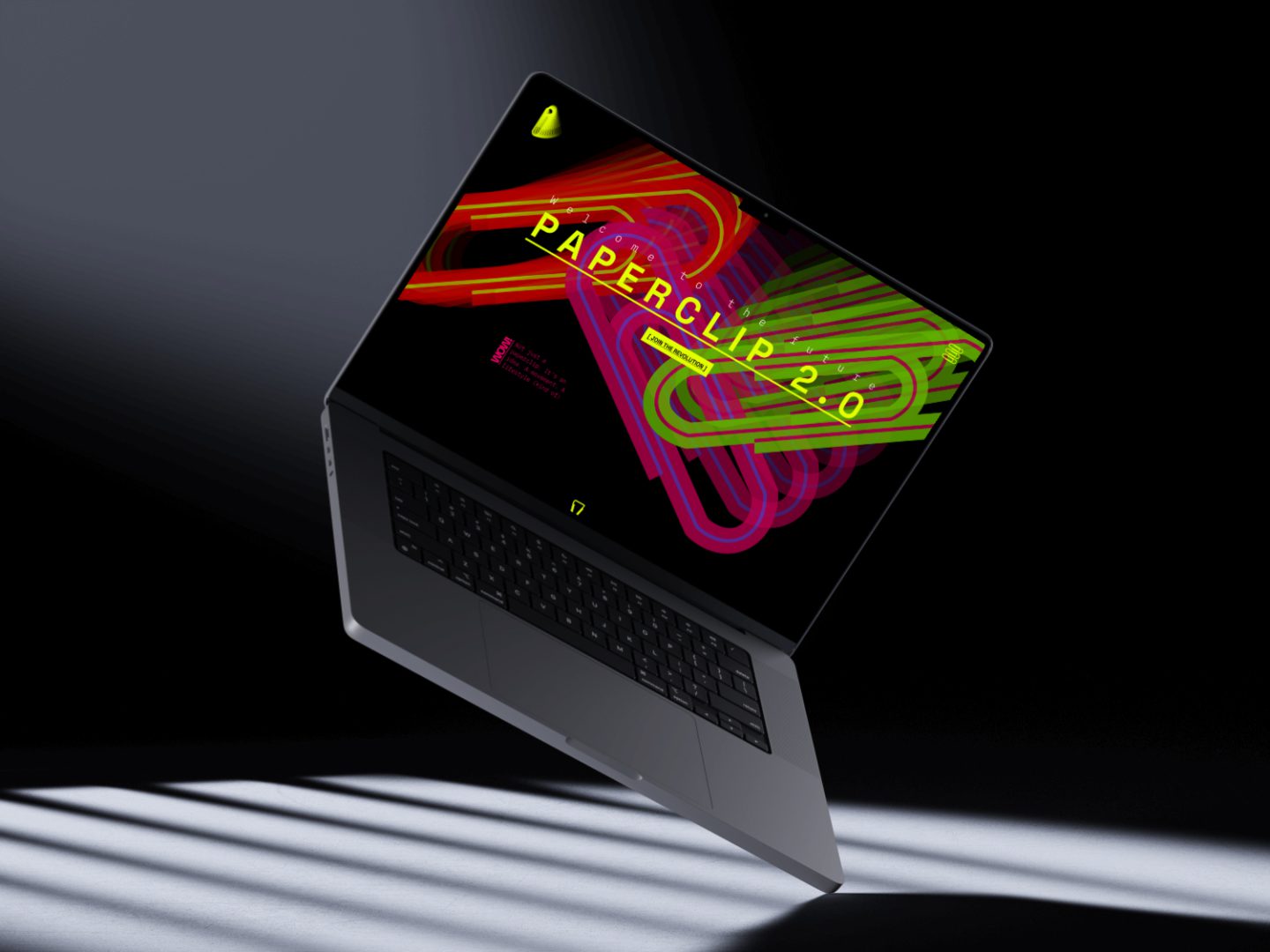
What happens when you give the world’s most boring office tool a rebellious rebrand? You get Paperclip 2.0.
What?
This project was developed as part of a two-day sprint in the Visual Design module. The challenge: create a conceptual landingpage prototype and newsletter layout using postmodern design principles. That means bold colors, chaotic layouts, playful irony, and a complete rejection of minimalism.
Instead of choosing a trendy tech product, I picked the most mundane object I could think of: the paperclip. My idea? To turn it into Paperclip 2.0 – a fictional, revolutionary redesign that makes this office supply the ironic star of the modern workplace.
The goal of the website is to provoke a double-take: is this real or just making fun of startup culture? Either way, it’s meant to be loud, confident, and deliberately over the top.
1 day
from concept to final prototype
14+
versions tested and tweaked in Figma
100%
of visual elements based on the paperclip
How?
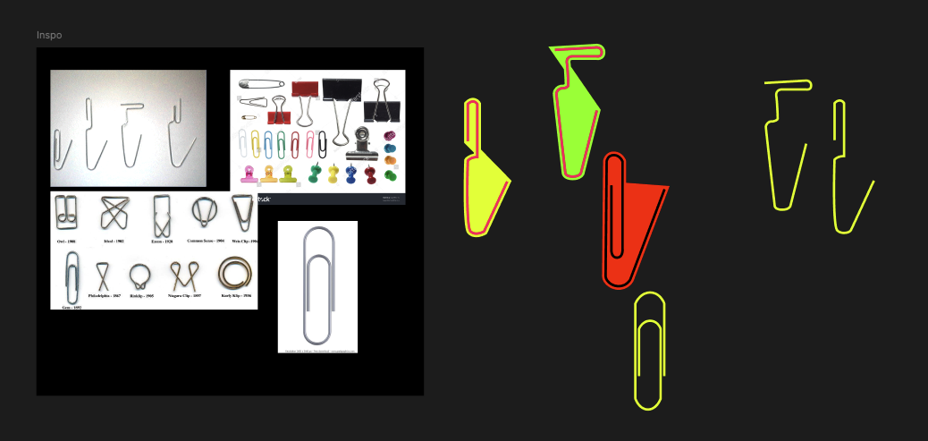
I started by sketching out ideas for the product identity: what if the paperclip were branded like a cult tech gadget? The prototype was then designed in Figma with a clear visual goal: embrace the chaos.
Design elements were created based on the classic paperclip shape, reinterpreted as vector patterns, abstract forms, and layout tools. The typography is oversized and unapologetically offbeat. The color palette is punchy and clashing on purpose — pinks, greens, yellows, and deep blues crash into each other with no regard for harmony.
The layout borrows from brutalism and postmodern web aesthetics: too much space, too little space, randomly huge text, unbalanced grids – all by design.
Design decisions:
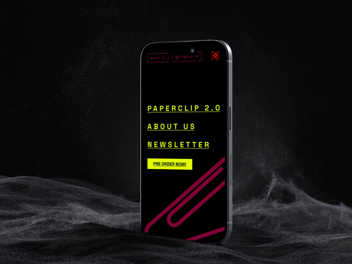
- Typography: mix of monospace + chunky sans-serif
- Colors: intentionally loud and clashing
- Layout: broken grid, unexpected scale changes
- Icons + shapes: all derived from the paperclip
Learnings.
Working with postmodern design taught me how much control you need to make chaos feel intentional. Some key insights:
- Constraints are still necessary, even in a rule-breaking system
- Irony needs visual clarity to work
- Versioning helps — many drafts led to better hierarchy
- Humor in design is powerful, but only if the execution is strong